SALISH HEBREW TYPEFACE
Custom Display Type & Environmental Identity
Role: Typography / Visual Identity / Research
Discipline: Type Design, Exhibition Branding
Tools: Adobe Illustrator, InDesign
THE CONCEPT
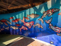
A custom Hebrew display typeface designed for the Seattle Aquarium, rooted in the art traditions of the Coastal Salish tribal nations of the Pacific Northwest. The project creates a deliberate dialogue between indigenous geometry and Hebrew typographic anatomy.
FORM & GEOMETRY
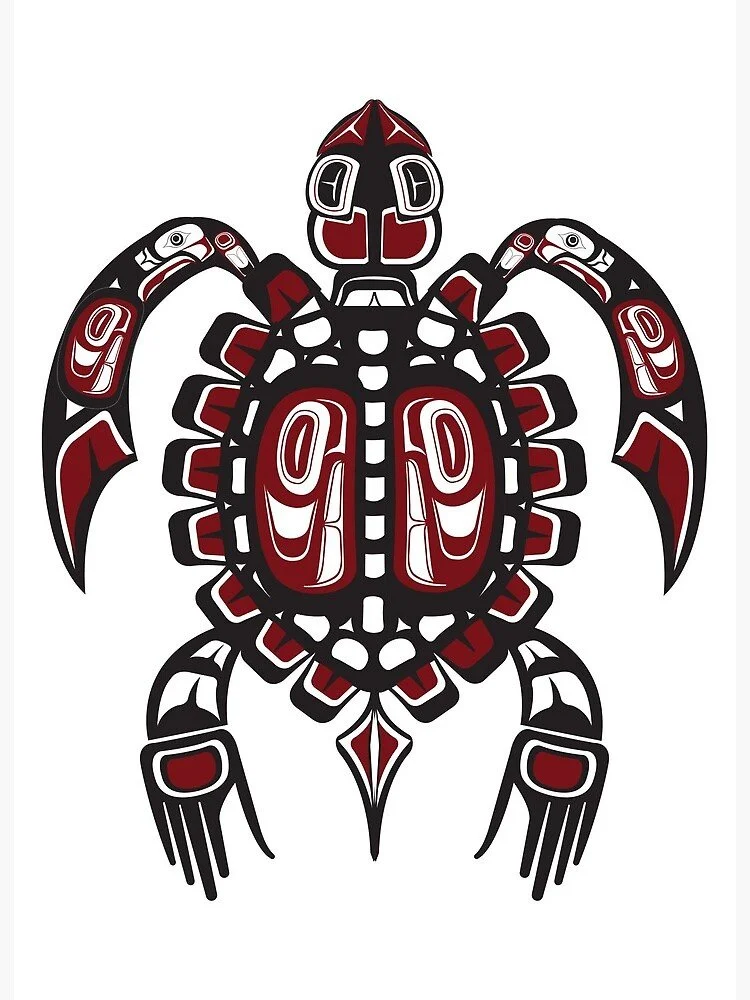
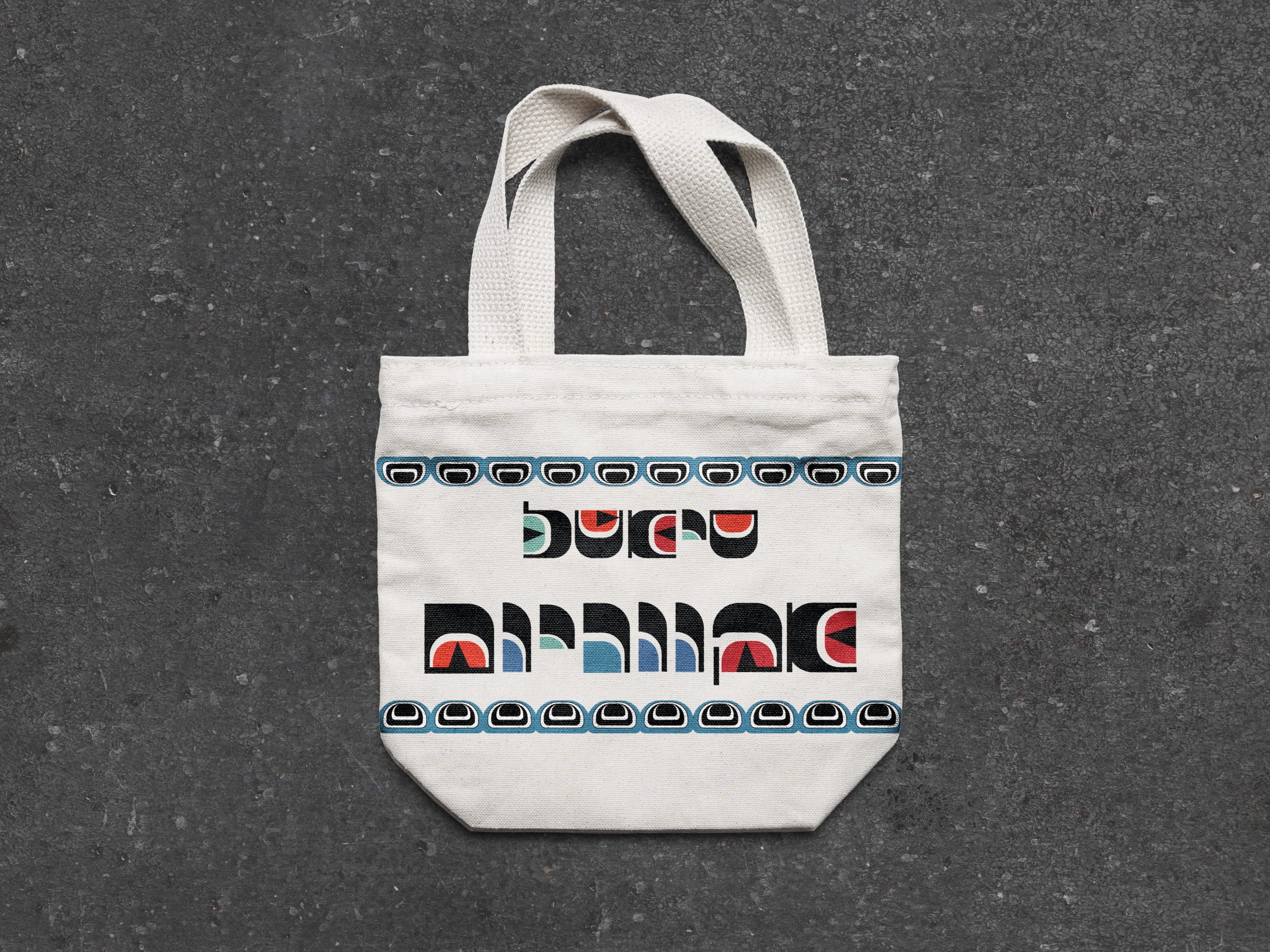
Rather than applying traditional patterns as superficial decoration, each character is engineered from the structural building blocks of Salish art: the ovoid, the U-form, and the split crescent.
Monolithic Weight: Massive black stems echo the physical presence of architectural cedar totems.
Negative Space as Relief: Counterforms function as inlaid relief cuts, framing stylized eyes and crescents.
Regional Pigments: Accents pulled directly from coastal cedar carvings: deep slate blue, seafoam teal, and vermilion red.
Typographic Legibility: Hebrew’s foundational roof strokes (gaggot) and descenders (yordot) remain structurally intact within the heavy modular grid.
APPLICATION
Environmental wayfinding and large-scale architectural signage
Bilingual exhibition identity systems
Exhibition type specimen book and promotional ephemera
Practicle Applications
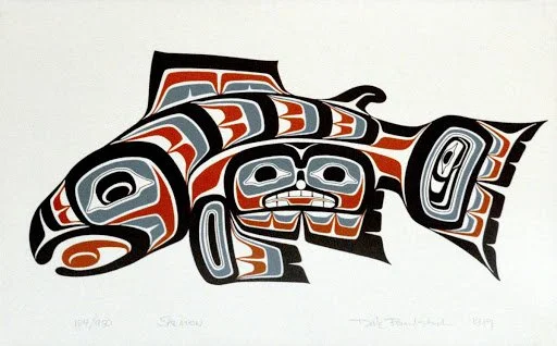
Salish Art Inspiration