HATZOFA (הצופה) / THE DIGITAL SANCTUARY
A rapid-access calming tool inspired by the architectural spirit of Safed.
THE BRIEF
City Assigned: Safed (Tzfat / צפת).
Challenge: Design an emergency-responsive digital product useful during times of war and acute crisis.
Constraint: Derive core UI/UX and brand identity directly from the visual heritage of the assigned city.
During conflict, sirens, and extreme anxiety, cognitive load spikes. Rather than another chaotic alert feed or news stream, Hatzofa (The Lookout / The Sanctuary) was conceived as an immediate emotional refuge—helping users access personal grounding media in seconds.
THE CONCEPT & UX STRATEGY
Pinterest Meets Emergency Emotional First-Aid.
When adrenaline surges, complex navigation fails. Hatzofa strips away algorithmic noise and infinite scrolling to provide a curated, high-contrast pocket sanctuary organized for instant cognitive relief under stress:
Zero-Friction Access: A high-speed, categorical interface designed to pull up calming media—comforting family photos, ambient soundscapes, curated music playlists, guided breathing clips, and grounding quotes, in 1–2 taps.
Curated Safe Haven: Users pre-load their personal anchors before a crisis occurs, ensuring immediate availability when offline or taking shelter.
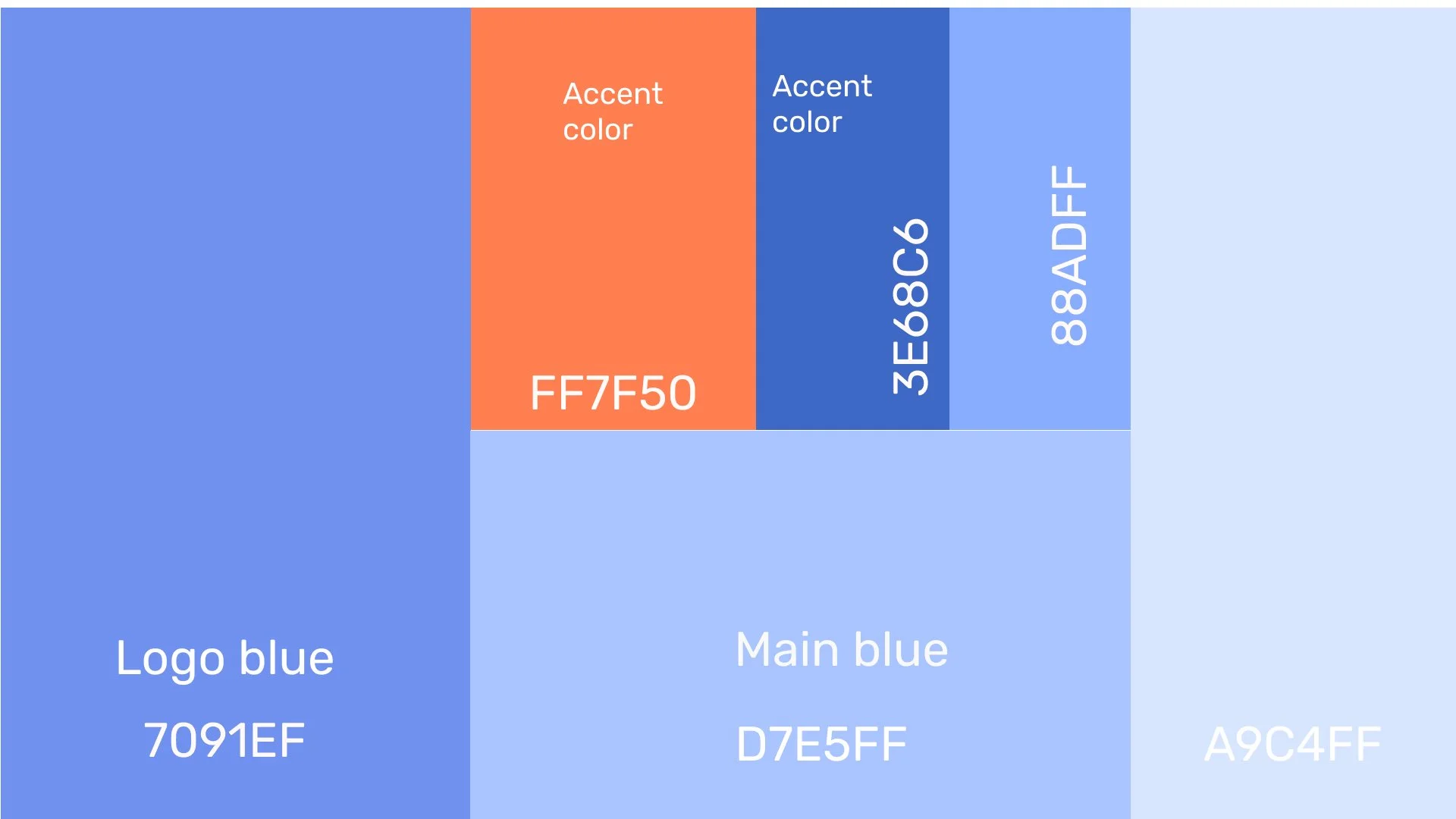
Color Psychology & Calming Palette: Leveraging Safed's historic, spiritual cobalt blue, traditionally used on doors and rooftops to ward off evil and evoke divine serenity, paired with warm terracotta to create an environment of safety, calm, and psychological grounding.
BRAND IDENTITY & LOGO DESIGN
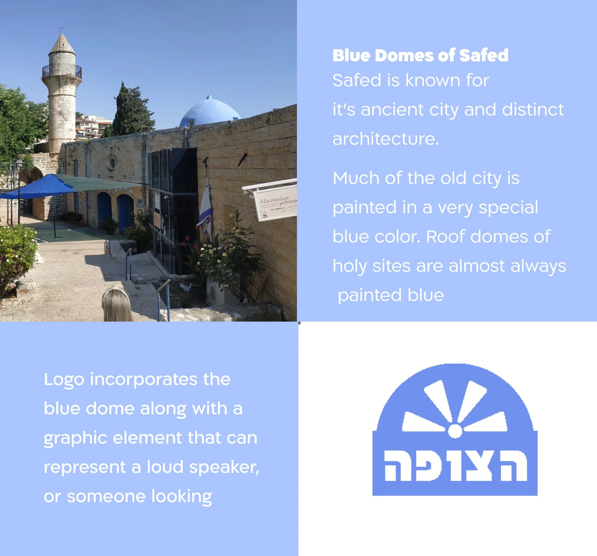
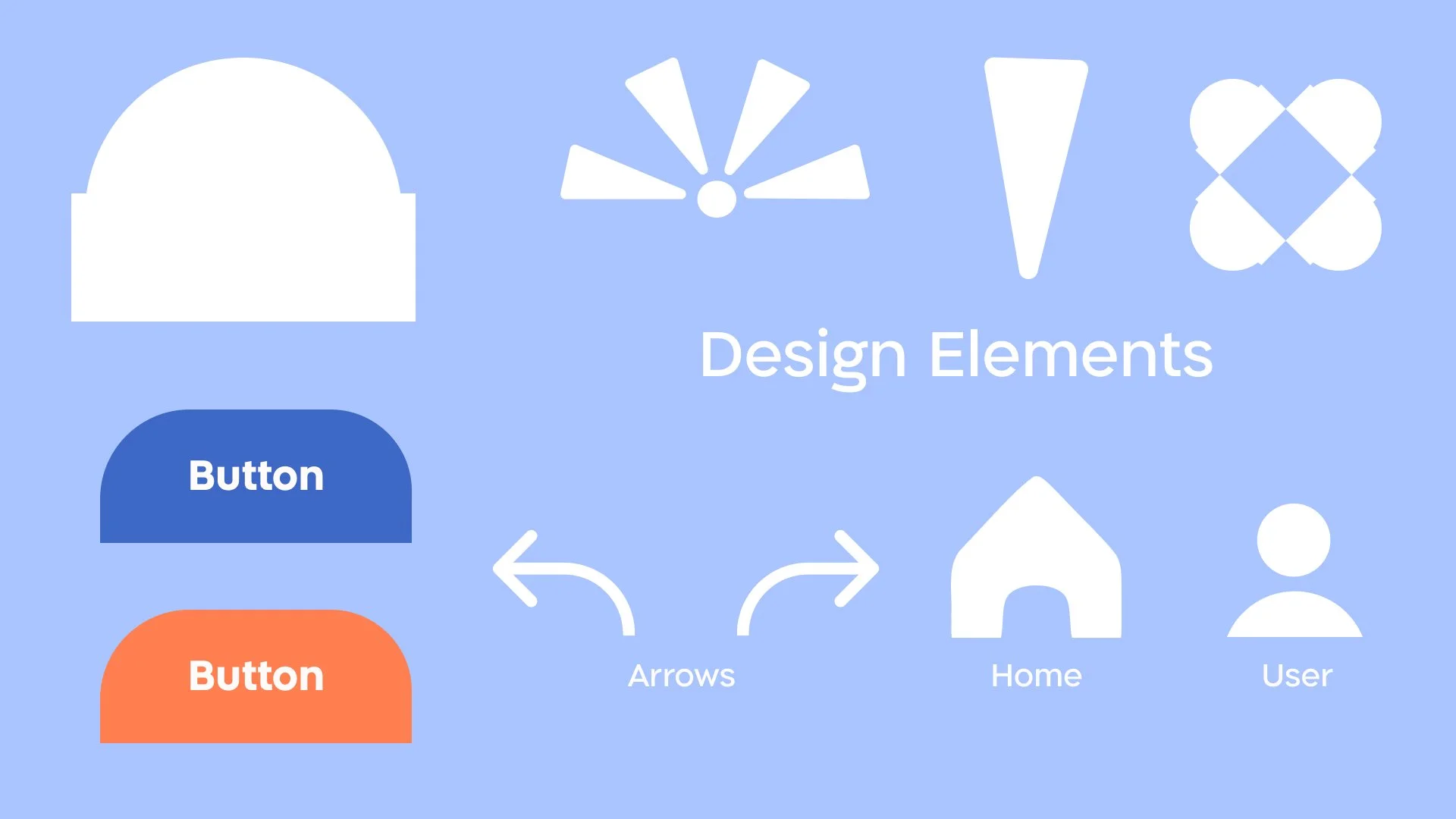
The Safed Dome: The icon mark distills the ancient stone archways and celestial blue-domed rooftops of Safed’s Old City into an expanding radiant beacon.
The Lookout Radiance: The upward sunburst rays symbolize perspective, protection, and a watchful anchor (Hatzofa) rising above surrounding chaos.
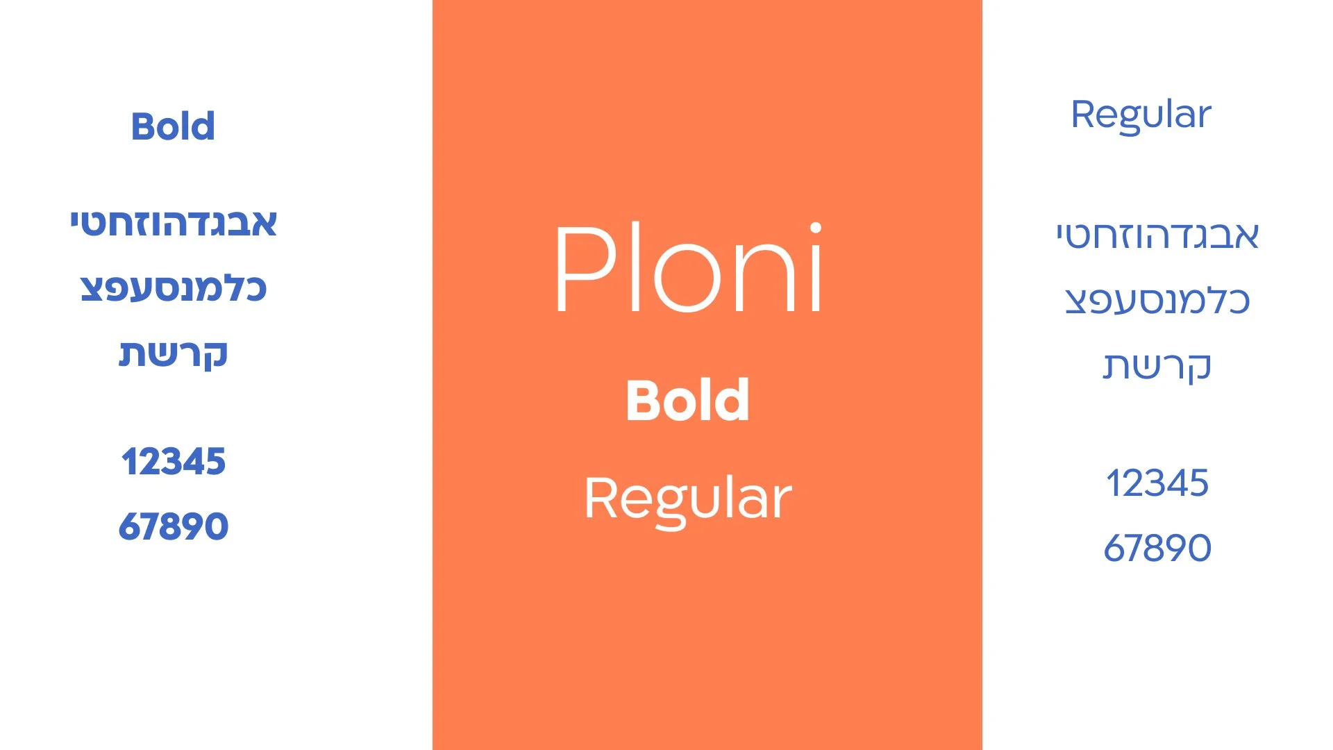
Friendly Hebrew Wordmark: Clean, welcoming Hebrew typography integrated directly into the arch geometry to reinforce structural stability.
UI ARCHITECTURE & KEY SCREENS
Splash & Rapid Authentication: Soft, approachable onboarding with single-tap social entry options.
Categorized Relief Feeds: Dedicated top-tab navigation switching between Images (תמונות), Videos (וידאו), Messages/Notes (הודעות), and Music (מוזיקה).
Favorites Vault (מועדפים): A dedicated, heart-tagged visual sanctuary showing only top-tier comfort triggers for ultra-fast access.
Ergonomic Bottom Navigation: Low-reach, intuitive thumb-zone navigation bar optimized for single-handed use during emergencies.
SPECS & DELIVERABLES
Disciplines: UI/UX Architecture, Brand Identity, Mobile App Design, Design for Crisis/Trauma
Tools: Figma, Adobe Illustrator, Adobe Photoshop
Deliverables: Visual Identity System, Mobile Design System, Interactive High-Fidelity Prototype
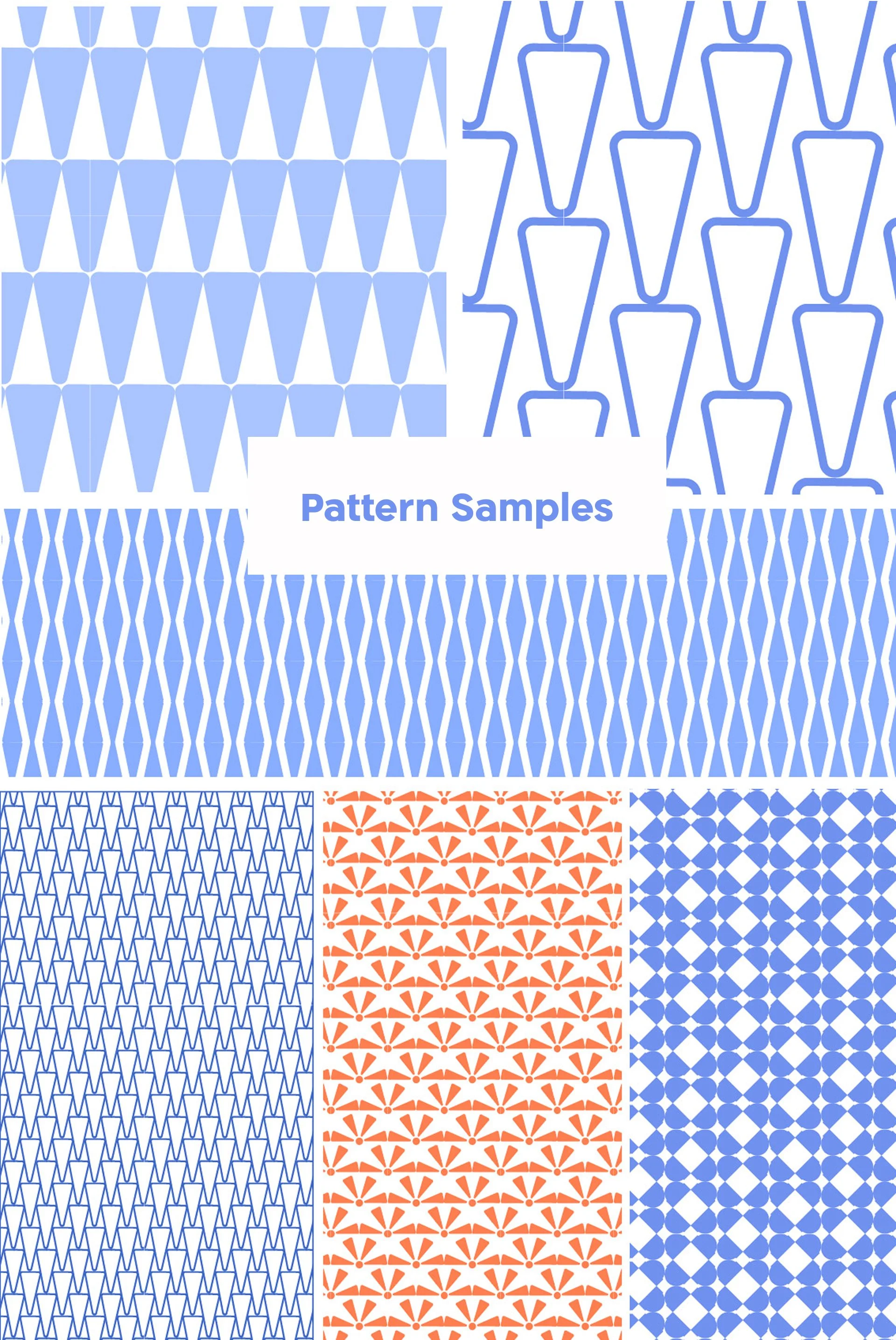
Logo and design elements