VEGAN FEST
Tri-Fold Event Collateral
Student Project / Editorial & Print Design
PROJECT BRIEF & CONTEXT
Project Type: Student Project / Academic Brief
Course: Graphic & Editorial Design
Discipline: Print Design, Layout Hierarchy, Typography, Visual Storytelling
Tools Used: Adobe InDesign, Adobe Illustrator, Adobe Photoshop
The Brief:
Select an existing brand or event organization and design a promotional, tri-fold event flyer. The objective was to build a cohesive visual identity and clear information hierarchy around real-world constraints—focusing on bold display titles, clear scheduling structures, and distinct visual personality.
THE DESIGN CHALLENGE
Event programs for multi-day festivals often suffer from two common issues:
Information Overload: Dense schedules and timetables that feel dry and overwhelming to navigate.
Predictable Marketing: Standard food photography that fails to build an emotional, memorable connection.
The challenge was to organize a full two-day schedule across a multi-panel folded format while creating a fun, quirky visual identity that instantly captures attention.
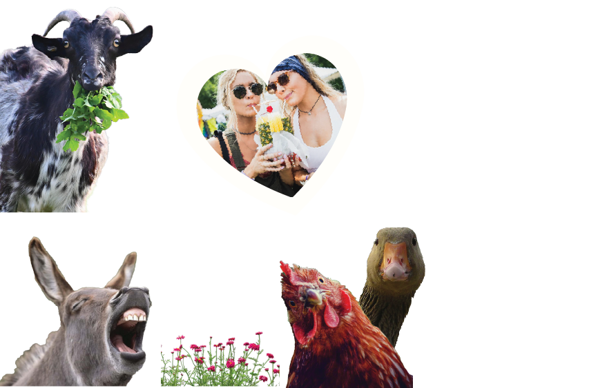
THE CONCEPT: ANIMALS ON THE MIC
Rather than relying on traditional human-centric or food-focused festival imagery, this concept flips the perspective: the animals take the stage as the event’s hosts and announcers.
Expressive Characters: An eclectic cast of animals.A munching goat, a wide-eyed goose, a laughing donkey, and a vocal sheep act as visual anchors throughout the layout.
Graphic Accents: Comic-style motion bursts and sound ticks give the characters a voice, turning static print panels into dynamic, loud announcements.
Community Vignettes: Heart-shaped photo cutouts frame real festival moments (community, cooking, kids, and music), creating a warm contrast to the graphic characters.
LAYOUT, COLOR & TYPOGRAPHY
Color-Coded Wayfinding
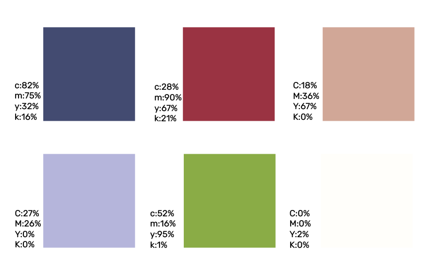
Panel Division: A vibrant triad of Earthy Olive Green, Warm Desert Blush, and Lilac Lavender separates the days and informational blocks for effortless reading.
Continuous Landscape: A continuous field of pink flowers runs across the baseline of all panels, visually unifying the folded cover and the open spread.
Typographic Hierarchy
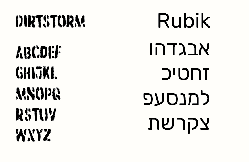
Display Headers: Tactile, distressed stencil type for primary English titles and dates, establishing a festive, organic poster feel.
Schedule Architecture: Clean, structured Hebrew body typography with prominent bolded timestamps (17:00, 18:00) for quick scanning.
THE DELIVERABLES
Outer Spread (Cover, Flap, and Contact):
Front cover featuring the goat visual anchor and primary event identity.
Back/center panel highlighting essential festival info (Park HaYarkon TLV, dates, contact details).
Flap panel introducing the "What's Happening?" event overview with curious animal character accents.
Inner Spread (Full Two-Day Schedule):
Opens into a wide layout displaying the full schedule for Thursday (18.6) and Friday (19.6).
Dynamic diagonal color blocking guides the viewer’s eye naturally across the fold lines toward the central community photos.
fonts
color palette